- Packages I will use to read in and plot the data
- Read the data in from part 1
Interactive graph
Start with the data
Use e_charts to create an e_charts object with Year on the x axis
Use e_river to build “rivers” that contain MobileMoneyAccounts by account. The depth of each river represents the amount of MobileMoneyAccounts.
Use e_tooltip to add a tooltip that will display based on the axis values
Use e_title to add a title, subtitle
Use e_theme to change the theme to roma
account_mobile   %>%
 e_charts(x = Year)   %>%
  e_river(serie = MobileMoneyAccounts, legend=FALSE)  %>%
  e_tooltip(trigger = "axis")  %>%
  e_title(text = "Annual Registered Mobile Money Accounts, 2006 to 2018",
          subtext = "(in millions of accounts). Source: Our World in Data",
          left = "center")  %>%
  e_theme("roma")
Static graph
Start with the data
Use ggplot to create a new ggplot object. Use aes to indicate that Year will be mapped to the x axis; MobileMoneyAccounts will be mapped to the y axis; account will be the fill variable
geom_area will display MobileMoneyAccounts
theme_classic sets the theme
theme(legend.position = “bottom”) puts the legend at the bottom of the plot
labs sets the y axis label, fill = NULL indicates that the fill variable will not have the labelled account
account_mobile   %>%
  ggplot(aes(x = Year, y = MobileMoneyAccounts,
             fill = account)) +
  geom_area() +
  colorspace::scale_fill_discrete_divergingx(palette = "roma", nmax =12) +
  theme_classic() +
  theme(legend.position = "bottom") +
  labs( y = "in millions of accounts",
       fill = NULL)
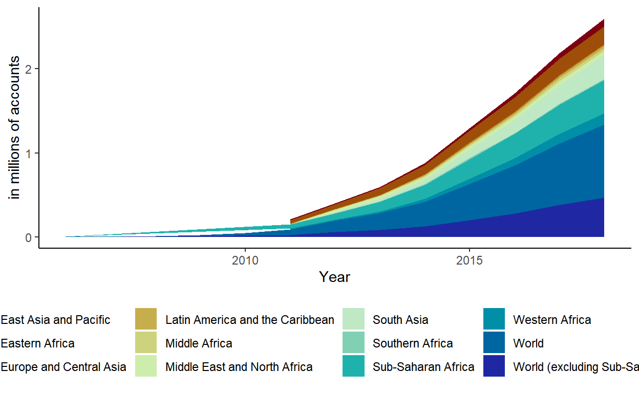
These plots show a steady increase in accounts since 2016. Accounts had a very big spike after 2011.